

Not The Final League Table: the under and over performers of 25/26
Our xG form tables are complete for the season. Sam Parry digs into the EFL’s biggest overperformers, underperformers, and what the numbers might tell us about next year.
Well, hello.
Our xG form guides for the EFL have been updated 👇

Words: Sam Parry
We started publishing xG form tables for all three EFL divisions back in October 2025, after the opening 10 games of the season. Expected goals data across the EFL, particularly in League One and League Two, remains relatively limited, so we hope this provides something that supporters and analysts can’t easily find elsewhere. We’re planning to build on that foundation over the summer, with home and away splits set to be added for next season — and maybe more!
As much as I always want outliers, anomalies, and teams breaking the model, we continue to place a huge amount of faith in expected goals as a clear indicator of underlying team quality. So, for the final Not The Top Table write-up of the season, I wanted to ask two questions:
Are those assumptions well-founded?
Who are the biggest outliers?*
*Answer: Hull, West Brom, Lincoln, Cardiff and Doncaster Rovers
Let’s answer Question 1 right away.
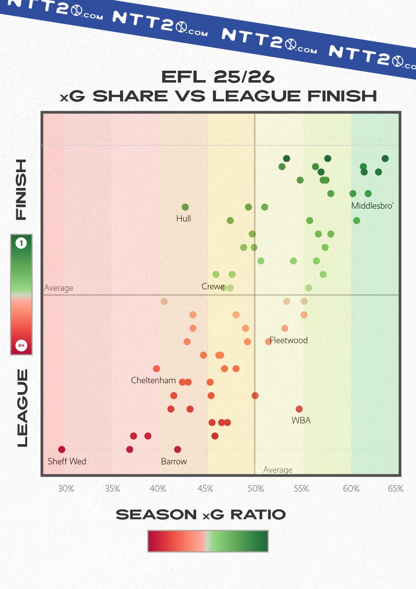
The graph below plots the league finish of all 72 EFL clubs against each team’s share of expected goals (xG Share) across the 2025/26 season. The overall shape of the chart is strikingly clean: teams with the highest xG shares overwhelmingly occupy the top half of the table, while sides with lower xG shares cluster toward the bottom.
Importantly, this visual does not measure whether a team over- or underperformed its underlying numbers. Instead, it examines how closely xG share aligns with long-term league outcomes.
The clearest takeaway is that there are very few big anomalies. Across all three EFL divisions, teams that consistently controlled a higher share of xG generally finished where their underlying process suggested they should.
There are some anomalies, though, so let’s take a look.
Championship anomalies
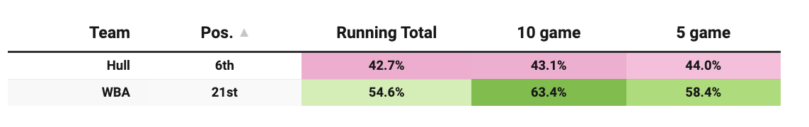
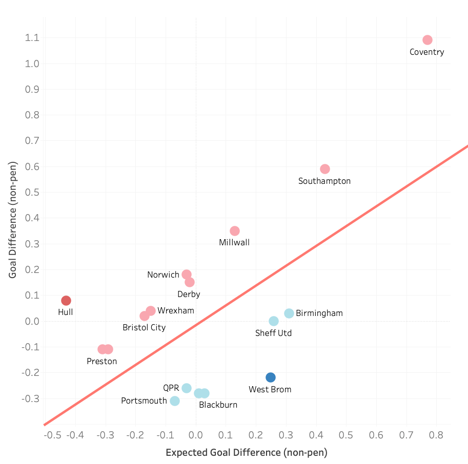
Case Study #1: Hull City and West Bromwich Albion
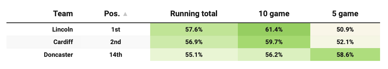
The first thing I want to look at is a simple head-to-head between West Brom and Hull, who were separated by 15 places, with startlingly different underlying numbers. Our comparison table shows how Baggies’ process has allowed for a substantially higher share of xG than Hull over 5-game, 10-game and season-long periods.
It’s easy to see why there is this disparity in the data when you look at the number of shots faced and taken by each club. Hull have a per-game shot deficit close to 4, whilst West Brom have a net positive of almost 3 shots per game over their opponents.
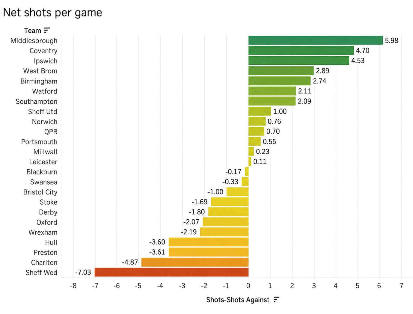
If you scan across every team, the logic holds that teams who consistently outshoot their opponents are more likely to be teams finishing higher up the table.
That said, there is evidently a wrinkle in xG models in how they underrate the performances of clubs that give up territory and shots to their opponents by dint of style or strategy. Earlier in the season, I wrote a deep dive on why Hull look not just bad but woeful in the data (and why I thought they’d win the play-offs – a prediction that’s still alive). At the time of writing, Hull were tracking at 2.10 points per game over 20 matches.
In their final 20, it was down to 1.45 PPG. While xG may not perfectly capture some context behind Hull’s success, it was ultimately a fair predictor of their regression. Had Wrexham won on final day, the Tigers would’ve lost their play-off place having once had a lead of eight points over 7th.
What of West Brom?
In West Brom’s case, managerial changes had the effect of creating a volatile level of performance. Ryan Mason was sacked after a period when WBA had the third-highest xG ratio over 5 games and the fourth-highest over 10. Their underlying numbers bottomed out under Eric Ramsay, before returning and improving to season-high levels under James Morrison.
Expected goals simply cannot account for managerial change, but there’s a fair argument that West Brom would never have been in a relegation scrap if they’d stuck with Mason – which isn’t to suggest anything about his nor Ramsay’s ability, but more of a point on making big tactical shifts mid-season.
Goals: the biggest underperformers and the biggest overperformers
Finally, let’s look at only those teams that can be said to clearly overperform or underperform their expected goal difference in the Championship. Any guesses for the two teams that stand out?
Classification is based on the gap between Goal Difference (non-pen) and Expected Goal Difference (non-pen) on a per-90 basis. Thresholds used:
Strong overperformance: > +0.45 GD above xGD per 90
Slight overperformance: +0.15 to +0.45
Slight underperformance: -0.15 to -0.45
Strong underperformance: < -0.45 GD below xGD per 90
Teams within ±0.15 are considered broadly in line with expected performance and are not highlighted.
League One anomalies
Case Study #2: Lincoln & Cardiff and Doncaster Rovers
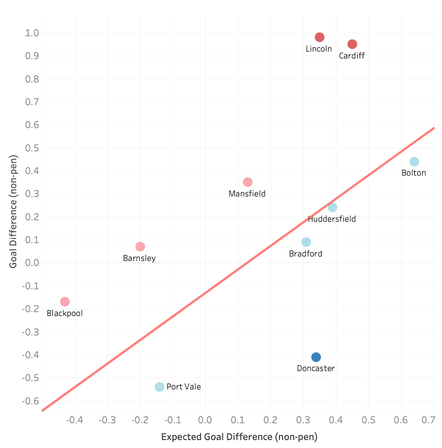
The two automatically promoted sides lead the way as overperformers. In many ways, that shouldn’t be a great surprise. Lincoln and Cardiff went up in 1st and 2nd place for quite different reasons. The former were defensively solid, and rank amongst the best sides in the country for set-piece goals. The latter were the most possession-heavy side in the league, and sustained incredibly strong attacking output over the whole season. Ultimately, goals against triumphed over goals for in that mini-battle.
But what of Donny?
Per xG ratio, Donny were just 2% behind Lincoln, who had the 2nd-highest share in League One (Bolton had the highest). Yet they finished 14th.
I think it’s fair to say that player quality made a dramatic difference, as a newly-promoted side. After they signed Hakeeb Adelakun and Elliot Lee in January, good underlying processes came up trumps. From 1st February, Rovers took the 6th-most points in League One – more than Bradford, Stockport and Bolton.
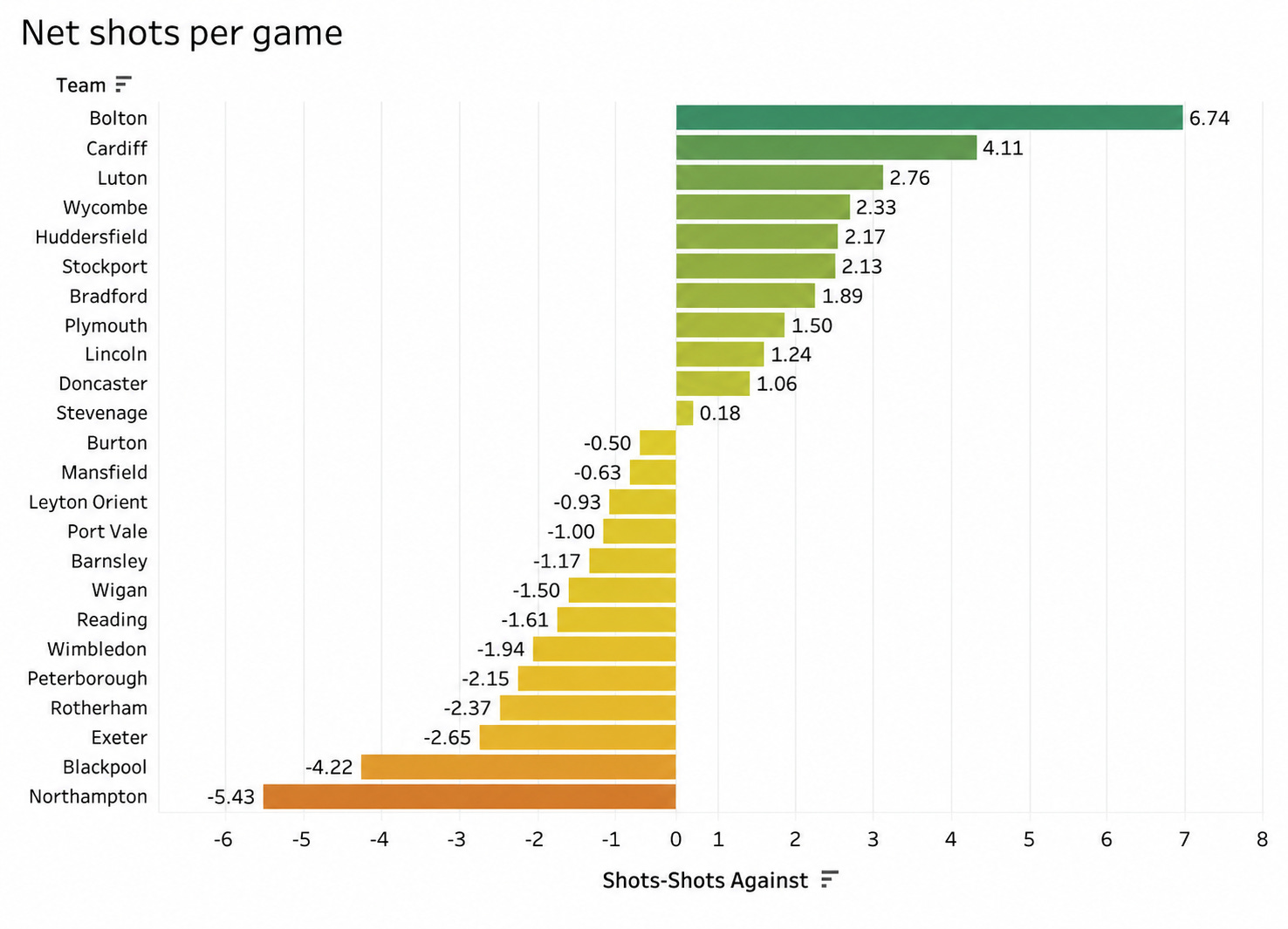
Only Lincoln (34) scored first in more games than Donny (26, joint-second with Cardiff). Rovers were one of 11 teams in the division with a net positive shot tally, and the only one in that group to finish in the bottom half. They are massively on my radar as a team to watch over the summer.
League Two Anomalies
Case Study #3: Top and Bottom
What stands out in the fourth tier is the sheer conformity with shot totals and league position. The only team with a net shot positive to finish outside the top half was Crawley. And what we’re really seeing is the diminishing possibility of huge outliers the further down the leagues you go.
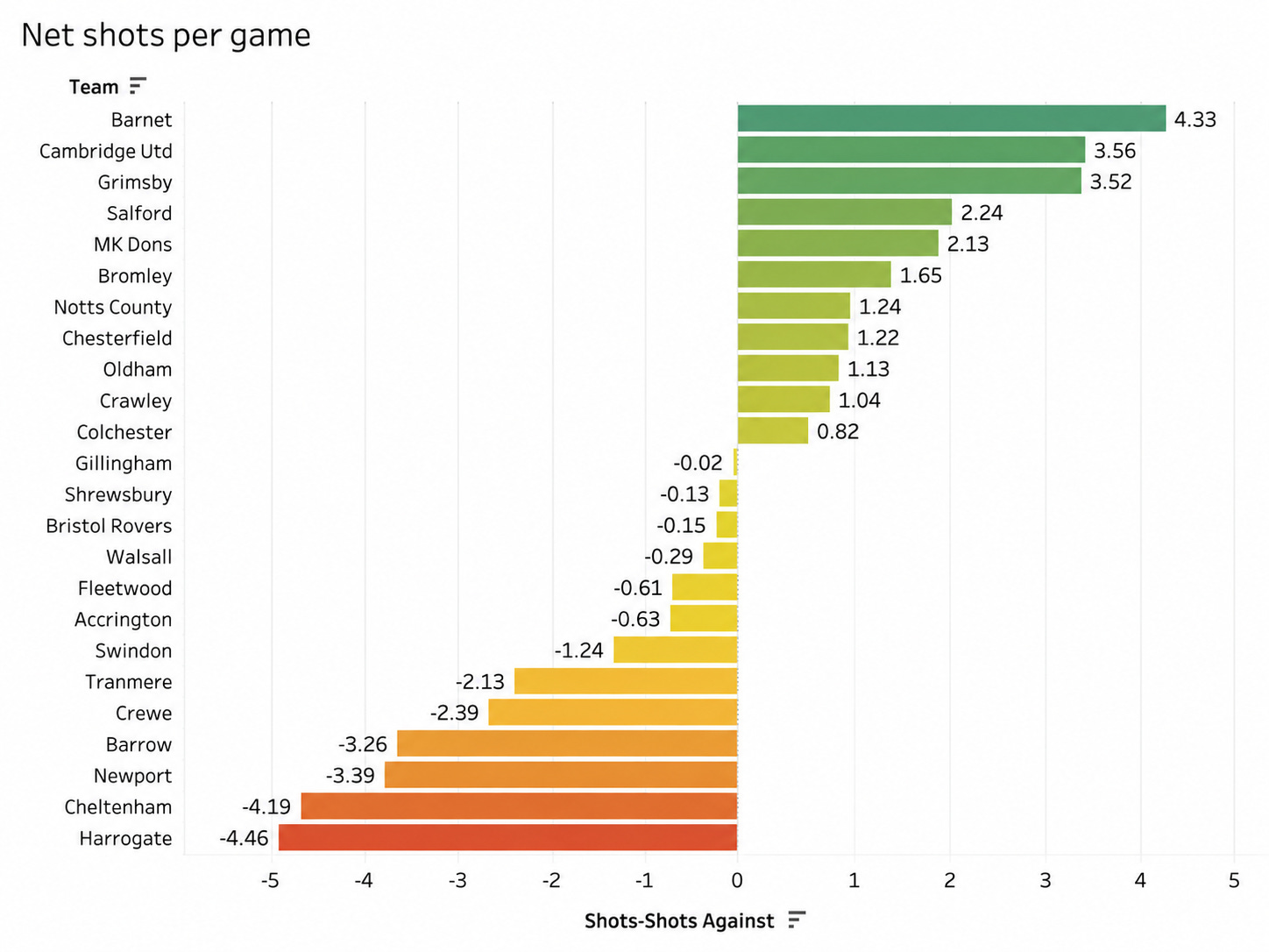
There seems to be a far greater disparity in player quality between the best and worst teams in Leagues One and Two than in the Championship, which instead has a bigger gap between the best sides and the next-best sides.
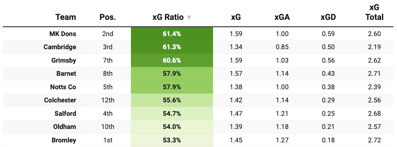
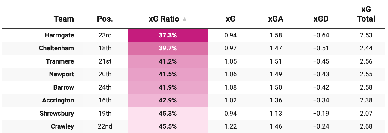
In League Two, the teams with a distinct overperformance were all top-half, and the sides with a distinct underperformance were all in the bottom half. More to the point, the top-half sides shown below were all serious candidates for promotion throughout most of the season, while the bottom-half sides were, with the exception of Gillingham, involved in the relegation battle for most of the season.
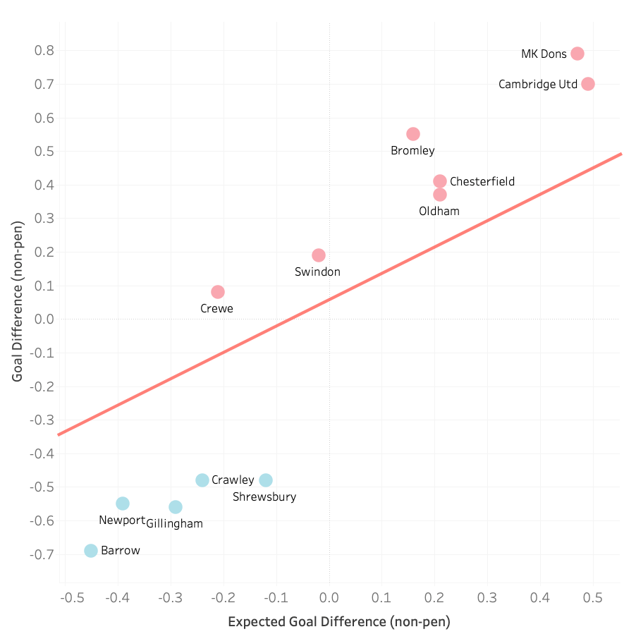
Perhaps what this should tell us, heading into next season, is that we can count on under/overperformance being sustained in League Two more than we can in the Championship. If a team is scoring more goals or conceding fewer than their xG data would indicate – whilst posting still-decent numbers – then we can probably place trust in their greater player quality over the season.
The inverse is also true. If teams are scoring fewer goals and conceding more, even though their xG implies they should be performing better, we can probably have faith that their lack of quality is going to hurt.
Lovely stuff, as usual 🙂